A logo is a company’s face, a trademark of a brand, an icon that being tiny can accommodate all the necessary information about the company, telling a story to a target audience. Although it may seem that there’s nothing difficult about creating a high-quality logo, actually it’s a hard work that requires a lot of preliminary preparations.
As we said, the main feature of a good logo is an expression of a brand’s uniqueness and presenting its vector in the market. But not every design team, not to mention the single freelancers, can create a real masterpiece.
Although each project is unique, yet there are several fundamental errors which are peculiar to designers of different levels, up to the professionals. In this article, we’re going to focus on the crucial mistakes that performers made when designing a logo.

Wrong Font’s Parameters
Development of a trade mark allows to experiment with different fonts and even to choose something unusual that may seem unacceptable in any other case. However, selection and use of a text component have the borders you should stick to.
When choosing a font for the logo, please avoid the expression of disparate thoughts – better collect all you have in mind and produce something harmonious. The font should fit not the logo only, but also the whole identity of the company.
Avoid many fonts in the logo. In this case, you risk creating an awkward rather than an original logo. Any respected trademark has no more than two fonts since it’s the optimal number for clear perception and remembering.
Complexity Along with Excessive Abstraction and Special Effects
This desire to put tons of info on one small icon may result in the complication of the logo and its inevitable failure. Another bad news is that complex logos are almost impossible to use in some specific situations like printing in one particular color.

If you feel that the logo needs some special effects or complementary colors – try to change it since most likely it’s a bad logo. That is why, to avoid similar errors and further problems with trademark use, please consider whether your logo looks well in black and white. This will help you to focus on the forms of the logo, its meaning, and the main message. Only then you can proceed to the selection of color gamut.
It happens that you want to create something that will help to identify your talents and abilities, but because of the complexity of the idea, there is a danger that it won’t work.
And you know – it won’t work☺. At least – for the reason that complex logos lose the details when scaled. In fact, ingenious is simple:
- High memorability
- Immediate understanding of the main logo’s message.
- Easy and simple reproduction.
These are the three concepts you should follow when deciding on whether you should include this or that element to the logo.
Try to create something original without overloading the logo with various objects. Complex logos badly remembered and associated, so please don’t waste your power in vain.
The Literal Representation of the Brand
Typically, it’s a mistake of the novices who often try to show the business of the company directly. Such designers often use visual clichés. Note that your brand won’t be original if you put tons of information in the logo but if you make it simple and understandable.
Plagiarism
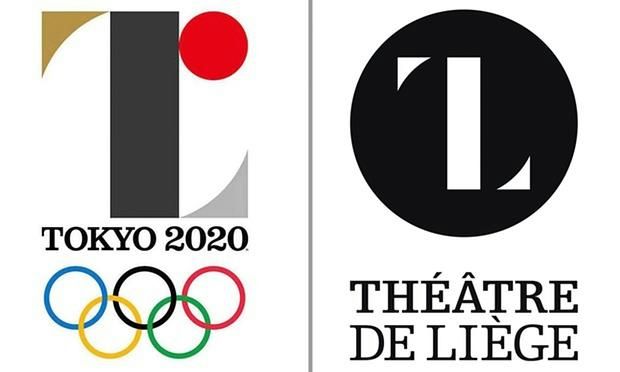
We always want our logos to be as good as the Apple’s or Nike’s ones. Alas, these desires often end with pure plagiarism. Please do not try to give other people’s ideas as your own since it the shortest way to failure. And primarily not because you may have problems with the law (however, keep in mind the intellectual property; otherwise, the result can be disastrous.) – you will just promote the already famous competitor’s brand instead of your growing company.

The Use of Raster Graphics
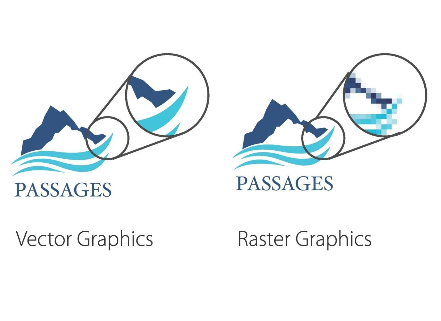
Today, when gadgets have become part of our lives, it’s crucial to ensure the pretty look of a logo on mobile screens. And the raster graphics is far from the ideal for this purpose. Raster images displayed poorly on mobile devices since they have problems with pixelation.
Therefore, use vector graphics – it’s scalable and does not lose it quality when the size changed. Besides, editing process and working with material and sketches are much easier as well.

But note that vector graphics won’t suit for the colors detailing. Also, vector images may be missing some effects such as falling shadows.
However, vector graphics is preferable, because it is perfectly aligned with responsive website design and looks great on Retina displays.
Following the Trends
New tendencies appear day after day. But that doesn’t mean you should blindly follow them. One of the main points of successful logo design is a test of time. We mean that when designing a logo you should find a solution that will work after 2, 5, and 10 years.
No doubts, you may redesign your brand in future. But every redesign is a complex process that does not always go smoothly and, therefore, better to be as “light” as possible, not changing the main concepts of the brand.
The design of a new logo is similar to buying a beautiful but extremely expensive dress: better if it stays unchanged, at least, for some time. The logo should be an investment for many years.
There are many other minor errors that we haven’t described. But one more crucial mistake is the restriction when creating a logo – whether it’s caused by customer’s view on the concepts of a “profitable” logo or your prejudice. To create a striking logo, please be a true creator – relaxed, nonstandard, and maybe even a little bit freaky.


