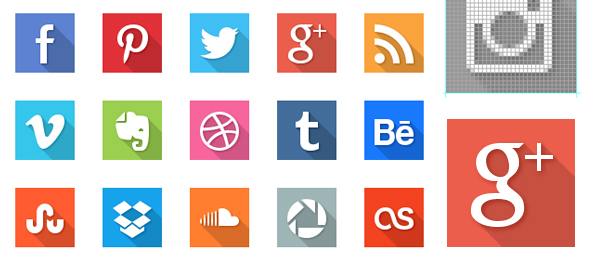
There is no doubt that Flat Icon Design is the most popular topic from around the design blogs and forums for the last couple of months. All major mobile operating systems started to use the Flat Design (Windows Phone + Metro, Android, iOS7).
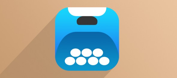
It seems that the Flat Design trend has already reached a new evolutionary level. Jeff Escalante, the one who initiate this trend discussion, called it Long Shadow Design. As he mentioned on a tweet it started as a joke: “I actually can’t believe what’s happening now. It was a joke but its evolved out of my control…”
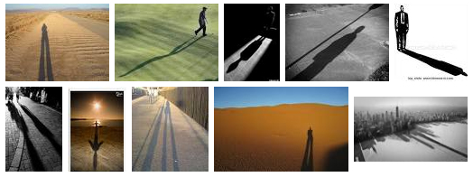
The term “Long shadow” was initially used by photographers and describes the light effect when the sun is rising or at sunset, when shadows are strong and long.
If you want to join to the team of designers worldwide who create Flat User Interfaces, you should read the Ultimate Guide To Flat Website Design on Hongkiat.com for more information about the principles of flat design.
We live in a world of html5 + css3, so there are already solutions for frontend developers to create buttons with longshadow only with css. Visit this page: http://sandbox.juan-i.com/longshadows/… or this one: http://codepen.io/awesomephant/pen/mAxHz… or this one: http://cssdeck.com/labs/google-fonts-css-longshade-icon.




Icon sets
Learn how to create a simple Flat Pencil Icon with Long Shadow!

