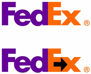
FedEx’s Fantastic Double Meaning
The FedEx logo is genius, but many people don’t realize why. In fact, the FedEx logo says much more than the company’s name in purple and orange text. There is also a hidden arrow inside the logo that symbolizes the speed and reliability of the courier service.
Did we just blow your mind? FedEx’s logo is a great example of a simple, easy to remember logo that also expresses the mission of its brand. By creating a logo that has a dual meaning, such as the FedEx logo, it is a great way for your company to stand out against the competition and emphasize your value proposition.
Pepsi’s Boring Logo
Over the years, there have been quite a few changes to the Pepsi logo. Most recently, Pepsi removed the company name altogether and left the image of the ball.

As a result, the company received a lot of backlash for the new logo, which was said to look like a fat belly more than anything else. And truthfully, as Pepsi competes against other, healthier beverages, it needs to get away from that image.
As a marketer, look at your competitors’ logos as inspiration. Pepsi has also received a lot of backlash because Coca-Cola has an elegant logo, whereas its logo doesn’t have as nice an appeal. Listen to your audience and see what they are loking for from your brand. Then use that inspiration to design your logo.
Amazon.com’s Interesting Hidden Meaning
Amazon.com has created such a recognizable brand that, when anyone needs to purchase something, they will often go to Amazon first. Although they have strong brand recognition, they also have a logo that reiterates just how much Amazon sells. The arrow in the logo points from the “A” in Amazon to the “Z,” symbolizing that they sell everything from A to Z. It also looks like a smile!

Amazon follows two great rules of logo design. First, it has a hidden meaning that reiterates its mission: “to build a place where people can come to find and discover anything they might want to buy online.” Second, it’s simple and doesn’t confuse customers with its message. Those two rules are a great model that marketers should consider when creating their brand logo.
Animal Planet’s Poor Redesign
Animal Planet is known as the go-to place to learn about animals. But its redesigned logo doesn’t imply that at all. Animal Planet’s new logo gets rid of the elephant and uses only text, with the letter “M” in animal oddly positioned on its side. Not only does this take away the important image of the elephant, but the new positioning of the “M” also looks awkward.

Animal Planet had a recognizable logo that was fun and playful, like the channel, but also made people understand that the shows on this particular channel would be about animals around the world. If you have a good logo that people understand and appreciate, leave it as is. The older logo was a simple explanation of a beloved brand. As talked about with Gap, “if it ain’t broke, don’t fix it.”
Source: blog.hubspot.com
And here are some good logo redesign examples:
 |
 |
 |
 |
 |
 |
Source: logodesignlove.com


