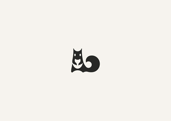
What is negative space? Basically, it is the empty area around the main elements in the layout, but it can be between or even inside objects. The negative space gives the objects a room to breathe.
It is often used in logos, on illustrations, posters, it becomes an active part of the visual presentation making key objects even more expressive.
We collected for you a few awesome uses of negative space in logo design. Enjoy!
Negative yet Positive lll –Bodea Daniel

Negative space –George Bokhua
Justice League –Sedki Alimam
Hello in Flowers -Marie Gardeski
